Dive deeper into the rebranding process of 2 companies in Singapore.
When hearing the terms ‘branding’ and ‘rebranding’, we typically notice the more tangible changes such as a new logo, new brand colours and the new look and feel of a physical store. However, what goes on behind the scenes? This article explores the rebranding process done by 2 well-known companies in Singapore, Lazada and Giant.
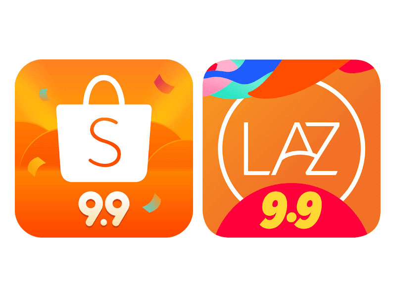
Lazada was one of the early e-commerce brands that entered Singapore’s market along with Qoo10 and Ezbuy before the emergence of Shopee. Through the years, the company noticed some issues with the company’s brand. Firstly, there was little brand differentiation between Lazada and many of its competitors. Before its 2019 rebrand, the company’s brand personality was very similar to Shopee’s.
Credit: GizGuide
Both Lazada and Shopee wanted to convey to customers that they were easy to navigate. Shopee included the brand values of ‘simple and happy’ while Lazada’s tagline was ‘effortless shopping’, and its orange brand colour showed its personality of being cheerful and uplifting. The logos of both Shopee and Lazada were also very similar. Lazada did not have a well-established branding structure and strategy. The Chief Executive Officer mentioned that the platform seemed too transactional despite prior efforts to emphasise being effortless and having a cheerful personality.
Therefore, the company took on a rebranding project with Superunion. It started with undergoing a brand audit to find out the different perspectives on the brand and craft out a more accurate brand purpose. Lazada surveyed over 100 of its stakeholders, ranging from employees and shoppers to sellers and partners, finding that they all shared the same goal of helping customers build better lives.
Then came establishing the brand fundamentals. Its new brand purpose was to help customers build better lives, while its new brand positioning was to be “a lifestyle destination that can enable and progress hopes, dreams and desires – whether you’re a seller or a shopper”, according to Lazada’s CEO.
With these in mind, Lazada crafted a new brand personality, which was to be positive and passionate for the future. The main direction for its brand communication and messaging strategy was to humanise the brand around positive, life improvement messages and insert more emotions to get closer to its customer base.
Subsequently, it embarked on the brand translation process. Superunion began with revamping Lazada’s logo to be more unique and aligned with its new positioning and personality while also showcasing the brand’s purpose.

The new logo featured a heart to express passion for one’s future and the font used is more rounded and appears more personable. The younger, vibrant colours paired with the gradient effect gave the brand an energetic look while reflecting the dynamism and vibrancy of shopping.
The slogan for Lazada’s new brand launch campaign was ‘go where your heart beats’. Marketing campaigns were aligned with the brand’s new direction. The campaign included a 3-part video series that featured 3 stories of personal pursuits made possible through Lazada. They follow an office worker pursuing his passion of becoming a rock musician, a young lady inspired by Lazada’s live streaming platform to create beautiful nail art, and a woman who turns her love for cookies as a child into a successful career as a pâtissier.

Credit: Marketing Interactive
Giant, a well-known company with its chain of supermarkets in Singapore, also decided to undergo a rebranding project in 2020. According to the Marketing Director, the company faced a major issue of inconsistency. Being managed by different teams resulted in a loss of consistent brand identity for Giant. There was also little differentiation from its competitors since its brand colours and personality were similar to Sheng Siong. The brand purpose of having good value and its mission of authenticity were not well reflected and Giant felt a need to upgrade the brand including its online business presence. Lastly, the company intends to continue lowering its prices for its customers in the future and wanted its brand to showcase that.
“For a rebranding to work, it cannot be a skin. Many companies do that and fail to realise that they have not addressed the fundamentals of the brand.” The Regional Marketing Director understood that the brand had to be revamped inside out from the fundamentals.
Keeping its brand purpose in mind – provide value for customers – Giant embarked on its rebranding journey. It built up a well-constructed brand strategy. Giant engaged UK agency Tickety Boo Creative and rebuilt its brand pillars which now include ‘great quality at affordable prices’ and ‘a warm welcome in every store’. It also had a new brand direction to convey freshness and show that they truly are affordable with good quality. Giant established a new brand personality of being friendly and warm along with a positioning of providing the best value, affordable prices with good quality, for customers through fresh products and warm service.
Finally, for the implementation side of things, it entered the brand translation stage. It revamped its logo into one with a fresh green colour to showcase how it carries fresh products. The logo was inspired by a mango, which is an affordable fruit enjoyed by many in the region, showcasing the brand’s affordability while bringing its brand closer to customers. It also replaced its outdated cursive script font with a san serif font to convey progression and modernity while appearing more open and friendly to consumers through authenticity in its products and customer service.
The retail supermarket was also redesigned to better fit the new brand strategy. Each supermarket department has a distinct yet cohesive feel that highlights ‘freshness’ and pictures of friendly employees smiling warmly.
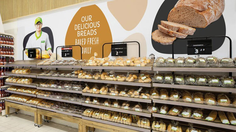
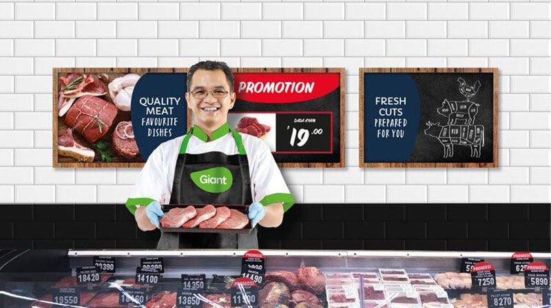
Credit: Tickety Boo Creative
Additionally, the team also included designs similar to a dollar store within the supermarket to highlight the brand’s fundamentals of providing value through affordable prices.
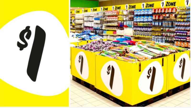
Credit: Tickety Boo Creative
Let us continue to observe how these rebranding projects transform the companies’ businesses.
If you would like to know more about branding and how it can be done for your company, contact us at info@bdsa.sg or through other methods at the bottom of the page.


